Case Study: Hoffman’s Chocolates | Logo, Packaging & Retail Design and Branding
By Dean Schwartz (SWAG Master): If you’re a frequent reader of this blog, you know that the topics are often centered on custom promotional products (or as we like to call it… SWAG with Style). But a few years ago SOBO took on a project that encompassed far more, which required us to demonstrate our wide range of capabilities. Enter Hoffman’s Chocolates.
Hoffman’s Chocolates | Logo, Packaging & Retail Design and Branding
THE CHALLENGE
Hoffman’s is a South Florida-based chocolate retailer with an impressive, and delicious, brand heritage. Not to mention, they have an extremely loyal following in Palm Beach & Boca Raton, FL. But, like any good company, they wanted to keep things fresh and they felt their brand (and entire store) was looking a bit tired. Below is a short list of the problems they approached SOBO with:
- Outdated packaging
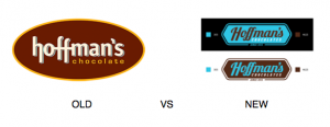
- An aged logo
- Bland color schemes
- Tired layout/design of stores
In short, any visual footprint for the brand was on the table as a reclamation project. SOBO SWAG Shops division to the rescue!
THE SOLUTION
SOBO dove head first into the work with Hoffman’s- here is what we accomplished:
- New logo design and identity guidelines. We chose a hexagon shape because it had a sweet connotation alluding to a honeycomb. Elongating the shape helped us encapsulate the brand name within a dynamic shape. The dark brown color conjures up images of chocolate but also a strategic decision. The color is dark enough to work with other colors in the packaging because brown can be a tough color to work with. Dark brown is contrasted against a bright shade of blue, PMS305 (a funny coincidence since we are from Miami). Studies show that blue in logos represents trust, honesty, and loyalty, which are all important to Hoffman’s brand.

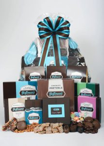
- New packaging. The first stage involved designing new sleeves for current boxes, as well as new labels and stickers. Not only do they look great, but they’re also functional. Everything is color-coded to make it easy for customers to identify the different types of chocolate. Milk chocolate is a light color, dark chocolate is a dark color, and milk/dark is a combo of both. We also encapsulated the logo within a “shield” form so we didn’t have to place the brown logo directly onto the different colored sleeves giving us more color options.

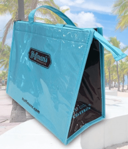
- Shopper bags. Stripes are a major part of the new Hoffman’s brand identity. This is evident from the outside awning to accent walls in the store, right down to the paper shopper bags we created. With these bags, we designed a subtle striped pattern on 3 different sizes. A very popular option is pictured below.

THE SOLUTION CONTINUED
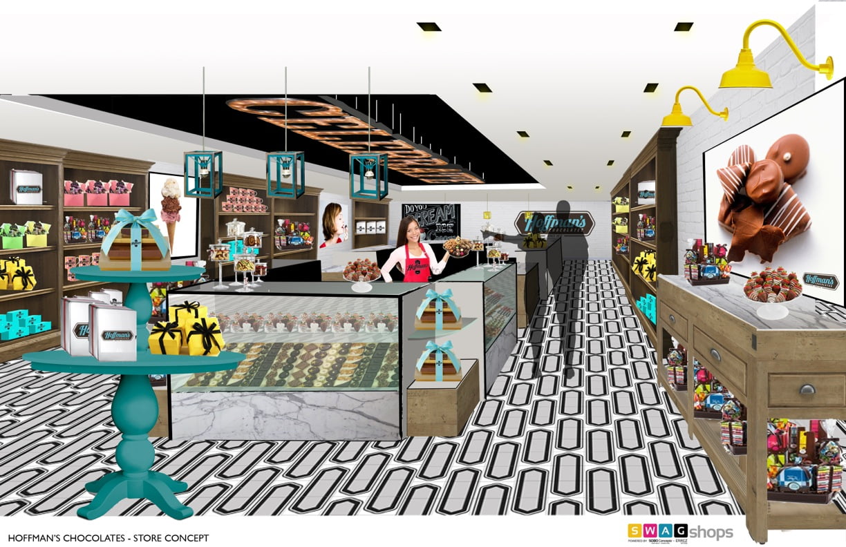
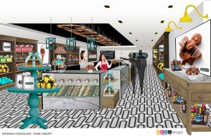
- Store design. Yes, that’s right, we redesigned the whole store! First, we created different design directions which the client could choose from. Eventually, Hoffman’s settled on the Celebration theme. From that, we created a concept that encouraged people to see Hoffman’s not just as a place to go for chocolate during major holidays, but to celebrate everyday life. Whether celebrating your child acing a test, getting a promotion, winning the soccer game, etc. Celebrate also came to life via marquee lights on the store ceiling.
- Pop-up shops and kiosks. To take advantage of the holiday season, Hoffman’s opened numerous pop-up shops and kiosks. For one of them, we took over a jewelry shop at the famed Sawgrass Mills shopping mall. For this shop, we tried to recreate the store look by creating a 3D wrap for the wall to give a brick look, similar to the stores, trying to maintain a unified look no matter where you get your Hoffman’s chocolate.
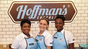
- Uniforms. We used white, cotton/poly, soil-resistant button downs with embroidered sleeve logos. We also created a custom printed apron and custom shaped name tags that people can actually write their names on, giving employees the chance to leave their own creative mark on their look, rather than an all-out stuffy, corporate look.
THE RESULT
The first store opened on Las Olas in Ft. Lauderdale in October 2014 and was a quick overhaul of an existing candy shop. The next store opened in March 2015 and was a full realization of our concept. They now have 7 brick and mortar stores in Florida, all of which have copied our uniform, packaging, and store design to a T.
All of this wouldn’t have been possible without our great partnership with the husband-wife dynamic duo, Ruben and Katie from Errez Design. It was (and still is) a lot of work to create and maintain, but we’re proud to say that the new look speaks for itself. It was a team effort and we were happy to help.
Need to give your retail design a refresh? Give SOBO a call at 888.752.0432 or mail info@soboconcepts.com and we’ll dive right in! Interested in seeing more recent options? Click here. And remember to always, SWAG with Style!
